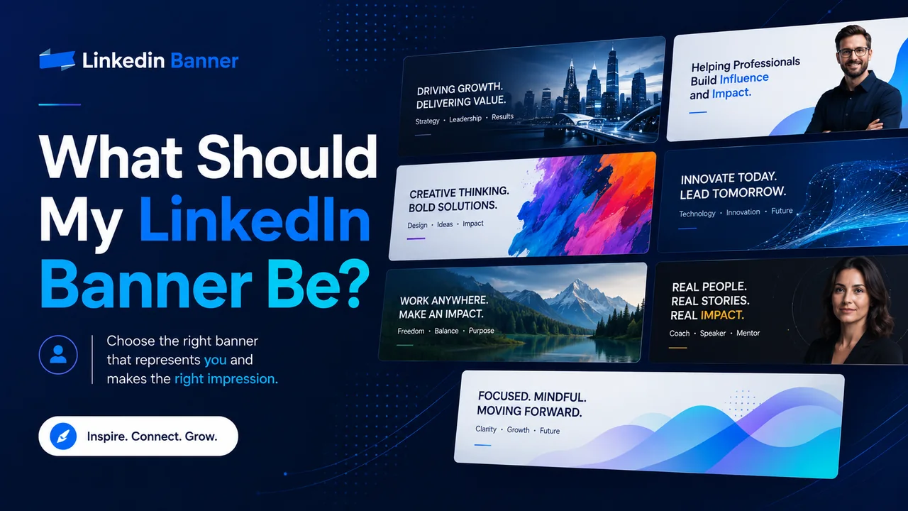
Your LinkedIn banner should quickly show people who you are, what you do, and what kind of professional image you want to create.
That is the simple answer.
But many people still get stuck when they open their LinkedIn profile and see that empty banner space behind their profile photo. They either leave it blank, upload a random city photo, use a blurry background, or add too much text until the banner looks crowded.
Your LinkedIn banner does not need to be complicated. It does not need to be fancy. It just needs to make sense for your profile.
Think of it like the sign above a shop. Before someone reads every detail on your profile, your banner gives them a quick feeling about you. Are you professional? Are you creative? Are you in tech, marketing, finance, healthcare, real estate, consulting, or something else? Do you work for a company, run your own business, or want to get hired?
A good LinkedIn banner helps answer that before people even scroll.
LinkedIn says your banner image appears behind your profile photo in the introduction section and helps make your professional story more visually appealing. LinkedIn also says it can help you stand out to recruiters, future employers, clients, and other members.
So, let’s talk about what your LinkedIn banner should be, what to avoid, and how to choose the right style for your career or business.
What Is a LinkedIn Banner?
A LinkedIn banner is the wide image at the top of your LinkedIn profile. Some people call it a LinkedIn banner, LinkedIn background photo, LinkedIn header image, or LinkedIn profile banner.
It sits behind your profile picture and gives your profile more personality.
Your profile photo shows your face.
Your headline explains what you do.
Your About section tells your story.
Your banner supports all of that with a visual message.
For a personal LinkedIn profile, LinkedIn currently recommends a banner image size of 1584 pixels wide by 396 pixels tall. The file should be JPG or PNG and less than 8 MB.
That size matters because LinkedIn crops and displays banners differently across desktop, mobile, and different screen sizes. LinkedIn also notes that how your image appears can change based on screen size and browser size.
What Should My LinkedIn Banner Be?
Your LinkedIn banner should be something that supports your professional goal.
That goal may be getting hired, attracting clients, building trust, growing a personal brand, showing your company, or simply making your profile look more complete.
A good LinkedIn banner usually does one or more of these things:
- It shows your industry.
- It explains what you do.
- It highlights your main skill.
- It shows your company or brand.
- It gives people a reason to trust you.
- It makes your profile look clean and active.
For example, if you are a software developer, your banner could show a clean tech-style background with a short line like:
Full-Stack Developer | React | Node.js | SaaS Products
If you are a real estate agent, your banner could show a professional city or home image with text like:
Helping Families Buy and Sell Homes in Dallas
If you are a business coach, your banner could say:
Helping Small Business Owners Build Better Systems and Grow With Confidence
The best banner is not always the one with the most design. It is the one that makes your profile easier to understand.
The Simple Rule: Make It Clear in 3 Seconds
Most people will not stop and study your banner for a long time.
They will glance at your profile, form a quick impression, and then decide whether to keep reading. That is why your banner should be clear in a few seconds.
Ask yourself:
- Can someone understand what I do quickly?
- Does the banner match my profile headline?
- Does it look professional on both desktop and mobile?
- Is the text easy to read?
- Does it feel like me or my business?
If the answer is yes, your banner is doing its job.
If the answer is no, it may be time to simplify it.
Best LinkedIn Banner Ideas
There is no one perfect LinkedIn banner for everyone. A job seeker, business owner, designer, consultant, student, and CEO may all need different styles.
Here are some simple LinkedIn banner ideas that work well.
1. A Clean Professional Banner With Your Job Title
This is one of the safest choices.
Use a clean background, your job title, and maybe two or three key skills. This works well if you are a job seeker, employee, freelancer, or consultant.
Example text:
Digital Marketing Specialist
SEO | Google Ads | Content Strategy
Or:
Project Manager
Agile Teams | Operations | Process Improvement
This type of banner is clear and easy to understand. It tells visitors what you do without making them search through your whole profile.
Best for:
- Job seekers
- Freelancers
- Consultants
- Students starting a career
- Professionals changing jobs
2. A Banner That Shows Your Industry
Sometimes the image itself can explain your field.
A healthcare worker can use a clean medical-style image.
A lawyer can use a professional office or law-related background.
A real estate agent can use a modern home or city skyline.
A developer can use a clean technology background.
A financial advisor can use a calm business-style image.
This works because people understand visuals quickly.
But avoid using the same overused stock photos everyone else uses. Try to choose something that feels natural and connected to your work.
A good industry banner should not look fake. It should feel believable.
3. A Personal Brand Banner
If you post on LinkedIn often, sell services, run a business, or want to become known in your field, a personal brand banner can work very well.
This type of banner usually includes:
- Your name
- Your main topic
- A short value statement
- Your brand colors
- A simple photo or clean graphic
Example:
Sarah Mitchell
Helping HR Teams Improve Hiring and Employee Retention
Or:
Ali Khan
B2B Content Writer for SaaS and Tech Companies
This makes your profile feel more focused. It also helps people remember you.
Best for:
- Coaches
- Consultants
- Founders
- Creators
- Freelancers
- Speakers
- Trainers
- Agency owners
4. A Company-Branded Banner
If you own a company or represent a brand, your LinkedIn banner can match your business website, logo, and colors.
You can include:
- Company logo
- Short tagline
- Main service
- Website
- Brand colors
- Simple background image
Example:
Dispatch Support for Taxi, Limo, and NEMT Companies
24/7 Call Handling | Trip Coordination | Driver Communication
This type of banner is useful because it turns your profile into a small business page. When someone lands on your profile, they immediately know what your company does.
Just make sure it does not look like a crowded advertisement. Keep it clean.
5. A Banner With a Short Value Statement
A value statement explains what you help people do.
This is stronger than only writing your job title because it focuses on the result.
Instead of:
Marketing Consultant
You could write:
Helping Local Businesses Get More Calls From Google
Instead of:
Career Coach
You could write:
Helping Professionals Find Better Jobs With Stronger LinkedIn Profiles
Instead of:
Sales Trainer
You could write:
Helping Sales Teams Book More Meetings and Close Better Deals
This type of banner works well because it speaks directly to the person viewing your profile.
6. A Minimal Banner With No Text
Not every LinkedIn banner needs words.
A clean, simple background can also look professional, especially if your headline and profile content already explain your work clearly.
A minimal banner can use:
- Soft abstract shapes
- Light gradients
- Office background
- City skyline
- Nature image
- Simple brand colors
- Clean pattern
This is a good option if you want your profile to look polished without making the banner too busy.
The key is to choose an image that looks sharp, calm, and professional.
7. A Portfolio-Style Banner
If your work is visual, your banner can show samples.
This works well for:
- Graphic designers
- Photographers
- Interior designers
- Architects
- Web designers
- UI/UX designers
- Brand designers
- Artists
- Content creators
For example, a designer can show small previews of their best work across the banner. A photographer can show one strong photo. A web designer can show website mockups.
But be careful. The banner is a narrow space, so too many images can become hard to see. Pick your best work, not all your work.
8. A Banner That Shows Trust
Trust matters on LinkedIn.
If you have strong proof, you can use your banner to show it in a simple way.
This could include:
- Years of experience
- Main industries served
- Awards
- Certifications
- A short client-focused message
- A clear business promise
Example:
10+ Years Helping Logistics Companies Improve Dispatch Operations
Or:
Certified Resume Writer Helping Job Seekers Stand Out
Do not overdo it. One strong proof point is better than five small claims squeezed into the banner.
9. A Location-Based Banner
If your work depends on location, your banner should make that clear.
This is useful for:
- Real estate agents
- Local service businesses
- Law firms
- Consultants serving a city
- Restaurants
- Medical practices
- Local agencies
- Event professionals
Example:
Helping Home Buyers and Sellers in Austin, Texas
Or:
Accounting Services for Small Businesses in Lahore
A location-based banner can help the right people know you serve their area.
10. A Banner With a Call to Action
A call to action tells people what to do next.
For LinkedIn, keep it soft and simple. Do not make the banner feel like a loud sales ad.
Good examples:
- Book a Free Consultation
- View My Portfolio
- Message Me for Collaboration
- Visit Our Website
- Download My Free Guide
This works better for business owners, service providers, coaches, and freelancers than for regular job seekers.
For job seekers, a better call to action may be:
Open to Marketing Roles
Available for Remote Project Management Roles
What Should I Put on My LinkedIn Banner?
Your LinkedIn banner can include a few simple things, but it should not include everything.
Good things to add:
- Your job title
- Your main service
- Your niche
- Your location
- Your website
- Your company logo
- A short value statement
- Your brand colors
- A professional background
- One clear call to action
Things you should avoid adding:
- Long paragraphs
- Too many icons
- Too many colors
- Tiny text
- Messy screenshots
- Low-quality logos
- Random quotes
- Personal photos that do not match your work
- Contact details that are hard to read
- Anything that looks like spam
The best LinkedIn banners are usually simple. They have one main message, not ten.
LinkedIn Banner Ideas by Profession
Here are some easy ideas based on different professions.
For Job Seekers
Your banner should help recruiters understand what kind of role you want.
Example:
Open to Data Analyst Roles
Excel | SQL | Power BI | Reporting
Or:
Marketing Graduate Seeking Entry-Level Digital Marketing Roles
Keep it focused on your target job. Do not make it too general.
For Freelancers
Your banner should say what service you offer and who you help.
Example:
Freelance Copywriter for Coaches and Online Businesses
Or:
Web Designer Helping Small Businesses Build Clean, Fast Websites
Freelancers should avoid vague lines like “Helping brands grow.” It sounds nice, but it does not clearly say what you do.
For Business Owners
Your banner should show your company, service, and main value.
Example:
Reliable Phone Answering and Dispatch Support for Service Businesses
Or:
Custom LinkedIn Banner Designs for Professionals and Companies
Keep the design close to your website colors so your brand feels consistent.
For Consultants
Your banner should show your area of expertise.
Example:
Helping B2B Companies Improve Sales Systems and Client Onboarding
Or:
Operations Consultant for Growing Service Businesses
A consultant’s banner should feel sharp, focused, and trustworthy.
For Students
Your banner can show your field of study, interests, and career direction.
Example:
Computer Science Student | Interested in Web Development and AI
Or:
Business Student | Marketing, Branding, and Social Media
Students do not need to pretend to be experts. A clear, honest banner is better.
For Developers
A developer banner can be simple and skill-focused.
Example:
Full-Stack Developer
React | Node.js | APIs | SaaS Tools
You can use a clean code-style background, but do not make it too dark or hard to read.
For Designers
Designers should use the banner to show design taste.
A clean layout, good spacing, and strong colors matter more than a long message.
Example:
Brand Designer Helping Startups Look More Professional
You can show a few small project previews, but make sure the banner still looks clean.
For Coaches
A coach’s banner should focus on the result they help people achieve.
Example:
Helping Professionals Build Confidence and Grow Their Careers
Or:
Leadership Coach for New Managers and Growing Teams
Avoid using too many motivational quotes. Your message should be clear and useful.
For Real Estate Agents
Real estate banners should include location and trust.
Example:
Helping Families Buy and Sell Homes in Miami
You can use a city skyline, home interior, neighborhood image, or clean property background.
For Healthcare Professionals
A healthcare banner should feel calm, clean, and trustworthy.
Example:
Patient-Focused Healthcare Professional | Care, Safety, and Support
Avoid anything that looks too loud or overly promotional.
What Color Should My LinkedIn Banner Be?
Your banner colors should match the feeling you want to create.
Blue feels professional, safe, and trusted.
Black feels premium and bold.
White feels clean and simple.
Green can feel calm, fresh, or growth-focused.
Orange can feel friendly and energetic.
Purple can feel creative or modern.
Gray can feel serious and balanced.
If you already have brand colors, use them.
If you do not have brand colors, choose two or three colors only. Too many colors can make the banner look messy.
A simple color rule is:
One main background color
One text color
One accent color
That is usually enough.
Should My LinkedIn Banner Have Text?
Yes, your LinkedIn banner can have text, but keep it short.
The banner is not the place for a full bio. It is a place for a quick message.
Good banner text may include:
- Your role
- Your niche
- Your service
- Your short value statement
- Your website
- Your call to action
Bad banner text usually includes:
- A full paragraph
- A long list of skills
- Too many contact details
- A quote that does not explain your work
- A message that only makes sense to you
The best text is usually one short headline and one small supporting line.
Example:
LinkedIn Banner Designer
Helping Professionals Make Their Profiles Look More Trusted
That is enough.
Where Should Text Go on a LinkedIn Banner?
Do not place important text too close to the edges.
Your profile photo covers part of the left side of the banner, especially on desktop. LinkedIn also says banner images may be cropped on different screen sizes and recommends keeping important information in the center, away from the edges.
A safe practical approach is:
- Keep the most important text around the middle or right side.
- Avoid placing text behind the profile photo area.
- Do not put important words near the corners.
- Check the banner on both desktop and mobile after uploading.
Even if your banner looks good on your laptop, it may crop differently on a phone.
What Makes a LinkedIn Banner Look Professional?
A professional LinkedIn banner usually has these things:
- Clear message
- Readable text
- Good spacing
- Sharp image quality
- Matching colors
- Simple layout
- No clutter
- No stretched images
- No random graphics
- No spelling mistakes
The design does not have to be expensive. It just needs to look clean and intentional.
People can tell when a banner was made in a hurry. They can also tell when it matches the person’s work and profile.
Common LinkedIn Banner Mistakes
Here are some mistakes to avoid.
1. Leaving the Banner Blank
A blank banner is not the end of the world, but it is a missed chance.
It makes your profile look less complete. Even a simple clean background is better than leaving the default space empty.
2. Using a Blurry Image
A blurry banner makes your profile look careless.
Use the recommended size and upload a clear image. LinkedIn recommends 1584 × 396 px for personal profile banner images, and if your image looks blurry, LinkedIn suggests choosing an image with a larger file size.
3. Adding Too Much Text
Too much text makes the banner hard to read.
Remember, people are not opening your banner like a brochure. They are glancing at your profile.
Keep it short.
4. Using Random Stock Photos
A random laptop, coffee cup, handshake, or city photo may look okay, but it does not always say anything about you.
Choose an image that connects to your work, industry, or message.
5. Forgetting Mobile View
Your banner may look different on mobile.
Always check your profile from your phone after uploading the banner. If the text is cut off or too small, adjust it.
6. Making It Too Salesy
LinkedIn is professional, but people still want to connect with real people.
A banner that feels too pushy can turn people away.
Instead of shouting, make your message helpful and clear.
7. Using Colors That Are Hard to Read
Light text on a light background is hard to see. Dark text on a dark background has the same problem.
Make sure there is strong contrast between the text and the background.
8. Using Old Company Branding
If your banner shows an old company, old job title, old service, or old website, update it.
Your banner should match where you are now, not where you were two years ago.
Personal LinkedIn Banner vs Company Page Banner
A personal LinkedIn banner and a LinkedIn Page banner image are not the same size.
For personal profiles, LinkedIn recommends 1584 × 396 px.
For LinkedIn Pages, LinkedIn lists the recommended Page banner image size as 4200 × 700 px, with PNG or JPEG format and a maximum file size of 3 MB.
So, if you are designing both a personal banner and a company page banner, do not use the exact same file without checking how it fits. The sizes are different.
What Should My LinkedIn Banner Be If I Am Looking for a Job?
If you are looking for a job, your banner should support your target role.
It should not look desperate. It should look clear and professional.
Good examples:
Open to Product Manager Roles
SaaS | User Research | Roadmapping | Cross-Functional Teams
Junior Web Developer
HTML | CSS | JavaScript | React
Customer Support Specialist
Helping Teams Deliver Better Customer Experiences
You can also include a soft line like:
Open to Remote Opportunities
But do not make the whole banner only about being unemployed. Focus on what you can do.
What Should My LinkedIn Banner Be If I Own a Business?
If you own a business, your banner should explain what your business does.
A visitor should not have to guess.
Good examples:
Custom LinkedIn Banners for Professionals and Company Pages
24/7 Dispatch Answering Support for Transportation Companies
SEO and Website Design for Local Service Businesses
You can include your logo and website, but keep it clean. The banner should create trust, not feel like a loud flyer.
What Should My LinkedIn Banner Be If I Am a Freelancer?
If you are a freelancer, your banner should tell people what you do and who you help.
Good examples:
Freelance SEO Writer for B2B SaaS Companies
Virtual Assistant for Busy Coaches and Consultants
Graphic Designer for Small Business Branding
This works because it tells the right people, “This person may be able to help me.”
What Should My LinkedIn Banner Be If I Do Not Know My Niche Yet?
If you are still figuring things out, keep your banner simple.
You can use:
- A clean professional background
- Your current role
- Your main skill area
- Your industry
- A simple personal brand style
Example:
Marketing Professional | Content, Social Media, and Brand Growth
Or:
Business Graduate Exploring Roles in Operations and Marketing
You do not need to have everything figured out before improving your banner.
Quick Checklist Before Uploading Your LinkedIn Banner
Before you upload your banner, check these things:
- Is the size 1584 × 396 px for a personal profile?
- Is the file JPG or PNG?
- Is the file under 8 MB?
- Is the text easy to read?
- Is the main message clear?
- Does it match your profile headline?
- Is anything hidden behind your profile photo?
- Does it look good on mobile?
- Are there any spelling mistakes?
- Does it feel professional?
If your banner passes this checklist, it is probably ready.
Final Thoughts
Your LinkedIn banner should not be random.
It should help people understand you faster.
If you are looking for a job, make it clear what role you want. If you are a freelancer, show what service you offer. If you own a business, explain what your company does. If you are building a personal brand, use a clean message that people can remember.
The best LinkedIn banner is simple, clear, and connected to your professional goal.
You do not need to add too many words. You do not need to copy what everyone else is doing. You just need a banner that feels right for your work and helps your profile look more complete.
A good banner will not do all the work for you, but it can make your LinkedIn profile look more trusted, more polished, and more worth reading.
FAQs About LinkedIn Banners
What is the best LinkedIn banner size?
For a personal LinkedIn profile, the recommended banner image size is 1584 × 396 pixels. LinkedIn recommends JPG or PNG format and a file size less than 8 MB.
What should I write on my LinkedIn banner?
Write a short message that explains what you do. You can include your job title, main service, niche, location, or a short value statement. Keep it simple and easy to read.
Should I use my company logo on my LinkedIn banner?
Yes, if you own a business or represent a company. But do not make the logo too large. Your banner should still look clean and professional.
Should my LinkedIn banner have my photo?
It can, but it does not have to. Your profile photo already shows your face. If you use another photo of yourself in the banner, make sure it does not make the profile look too crowded.
Can I use a quote on my LinkedIn banner?
You can, but it is usually better to use a message that explains what you do. A quote may look nice, but it may not help people understand your work.
Why does my LinkedIn banner look blurry?
Your image may be too small, too compressed, or not the right size. Use a clear image with LinkedIn’s recommended dimensions. LinkedIn also suggests using a larger file size if the banner image appears blurry or pixelated.
Should my LinkedIn banner match my website colors?
Yes, especially if you are a business owner, freelancer, consultant, or personal brand. Matching colors make your online presence look more consistent.
Do I need a different banner for my personal profile and company page?
Yes. LinkedIn recommends different image sizes for personal profile banner images and LinkedIn Page banner images. Personal profile banner images are 1584 × 396 px, while LinkedIn Page banner images are listed as 4200 × 700 px.
Source Notes
Explore More LinkedIn Banner Ideas
Browse free banner designs and choose a style that fits your profile, company page, or personal brand.